← Back to work
CASE STUDY · 01 · ENTERPRISE

Audit & Advisory tools for a Big 4 firm.

Multiple product teams. Fragmented tooling. Eight projects across two years.

Role Product Designer
Timeline 2 years, 2022 - 2023
Team Varies per project
Status NDA · anonymized

Fragmented tools, no shared language.

Enterprise audit teams at the firm worked across multiple disconnected software products. Each team had its own tooling and its own way of capturing and handing off data.

I joined mid-stream and had to understand how work actually happened before I could change anything.

Fragmented tooling created friction for people doing real work.

Find the real workflow first.

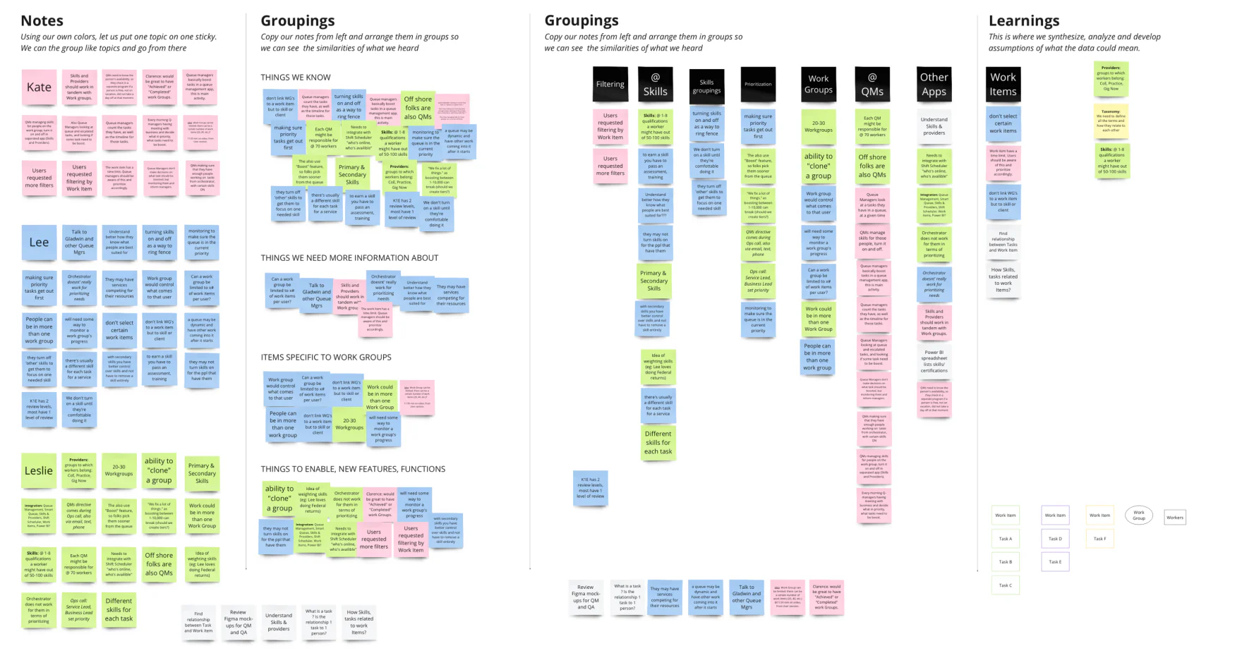
I ran extractive research sessions with the product team. The goal was to understand the real workflow before proposing any changes to the UI.

  1. Affinity mapping. Clustered what users actually did against what the specs described. The two didn't always match.
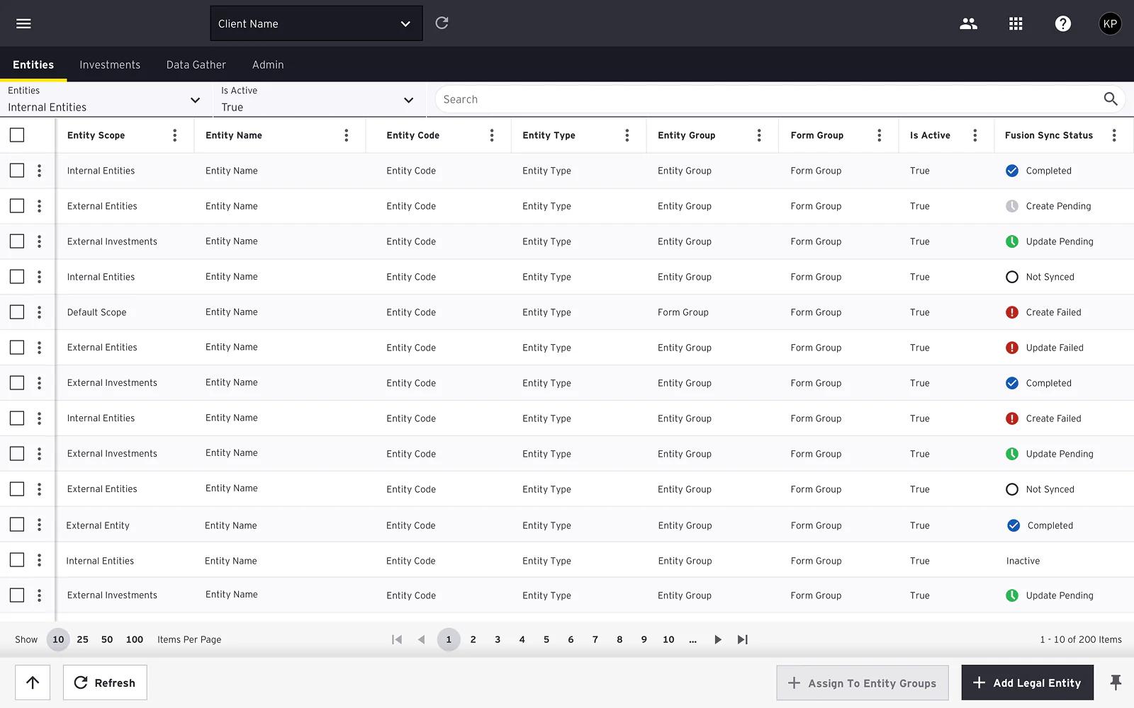
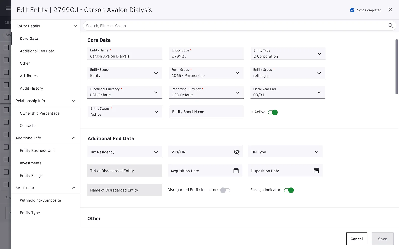
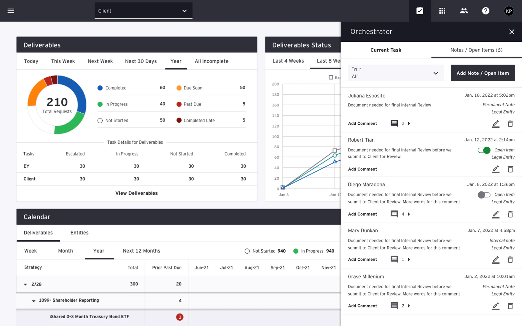
  2. App mapping. Reconstructed the full task structure across the platform, which gave us an app map of the complete engagement flow.
  3. User flow analysis. Covered all screen states and transitions, so we could see where the flow broke down.
  4. User personas. Grounded design decisions in who was actually using the product.
Affinity mapping board: hundreds of sticky notes grouped into Notes, Groupings, and Learnings columns, clustering what users actually do versus what specs describe.
Affinity board from the research sessions. Notes captured per participant, then clustered into groupings and synthesized into learnings.

UI across eight projects. From scratch and in-flight.

Some projects were new products built for specific audit workflows. Others were existing tools that needed UI updates. I worked on both.

I contributed to the firm's shared design system as an active user. When a project needed a component that didn't exist yet, I proposed it and helped build it.

One decision I'm still happy with is the engagement shell. It's the persistent context panel that tells you which client, period, and engagement you're in at all times. Cheap to design, and it kept people oriented across an otherwise dense workflow.

I also led and mentored a junior designer for roughly six months.

New product UI: a legal entities management screen with a dense data table. Columns for entity scope, name, code, type, group, form group, active status, and a Fusion sync status with color-coded states (completed, pending, failed, not synced).
New product UI. Entity management table with per-row sync status, bulk selection, and inline actions. Anonymized data.
In-flight tool update: an Edit Entity panel with a left navigation tree (Entity Details, Relationship Info, Additional Info, SALT Data) and a Core Data form with grouped fields, dropdowns, toggles, and a Sync Completed status.
An existing tool I updated in flight, working within its established patterns. Anonymized data.
Engagement shell: a dashboard with a Deliverables donut chart (210 total requests by status), a deliverables status trend chart, a calendar, and a slide-over Orchestrator panel showing notes and open items with comment threads.
The engagement shell. Persistent dashboard with the Orchestrator panel keeping notes, open items, and current task visible throughout the workflow. Anonymized data.

Shipped work. Lasting components.

Across two years and roughly eight projects, designs shipped into production. Components I contributed made it into the firm's shared design system.

The junior designer I mentored became an independent contributor by the end of the engagement.

What I'd do differently.

I moved too fast to high-fidelity on a few projects before confirming technical constraints with engineering. Earlier check-ins with developers would have saved multiple revision rounds.

NEXT CASE · 02 · ENTERPRISE / AI

Enterprise UI and AI ideation at a Big 4 firm.

Read case study