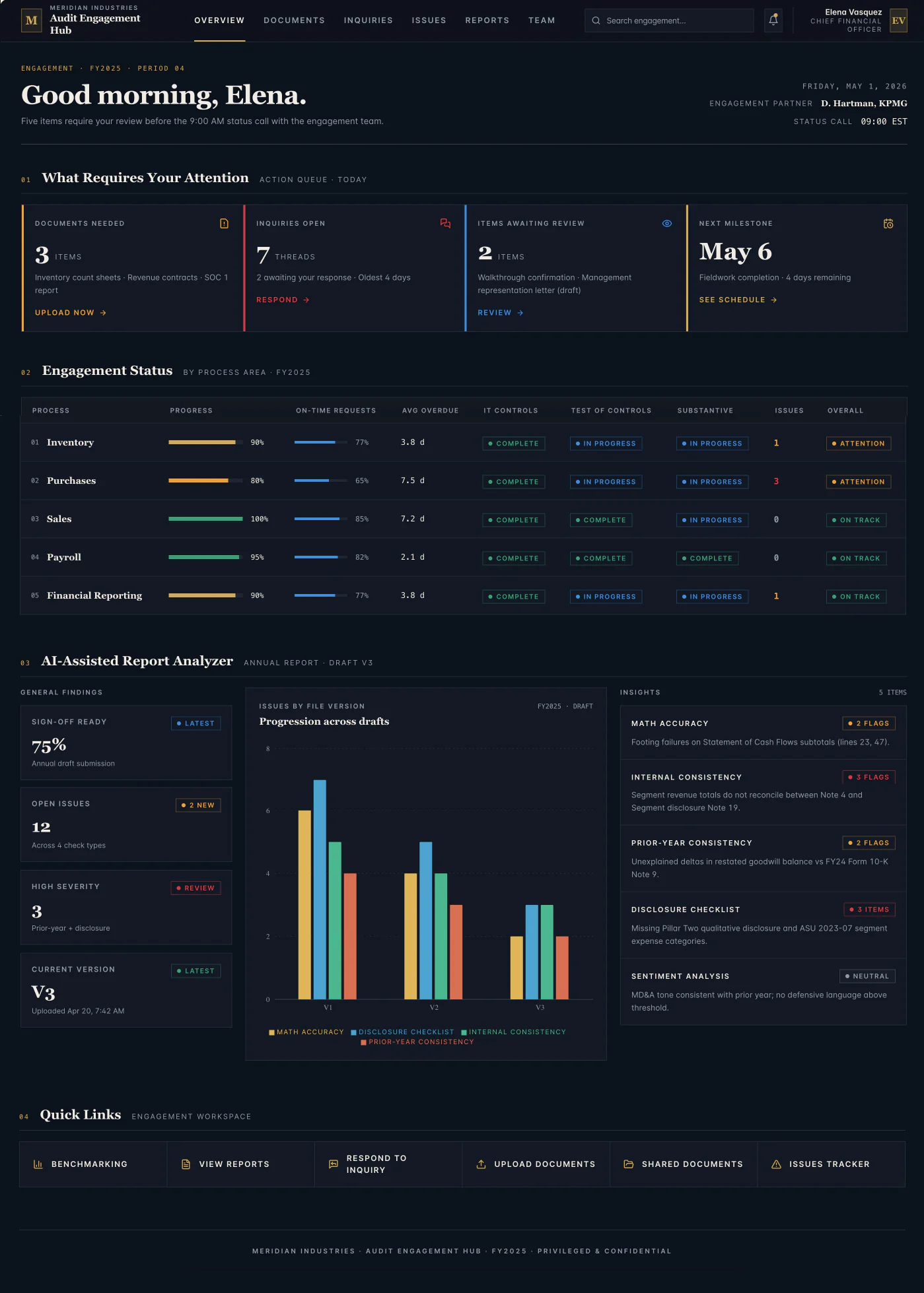
A CFO, not an auditor.
Elena is a CFO. She opens this between meetings to check where the quarter's audit stands before a 9 AM status call. She is an expert, but her expertise is finance and decisions, not working a findings register line by line. An audit manager lives inside the detail. She does not.
The brief was one requirement. In ten seconds she has to know what needs her this week and what is running fine without her. The trap is obvious only if you know the user: an audit dashboard can be impressively complete and still be the wrong tool for a CFO.
I gave that brief to two AI tools and designed it myself. Here are the three results.
MINE
Kate
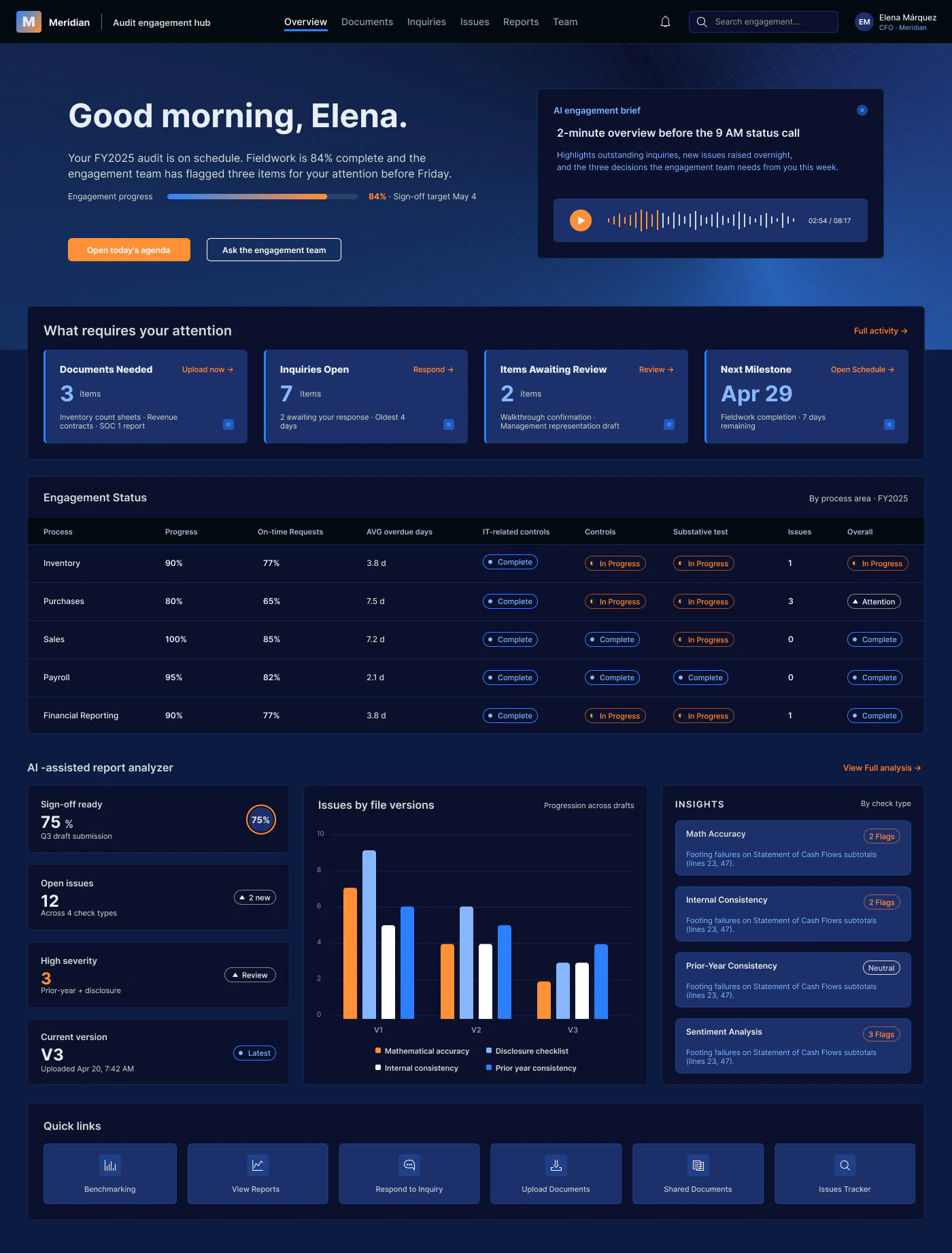
AI
Claude
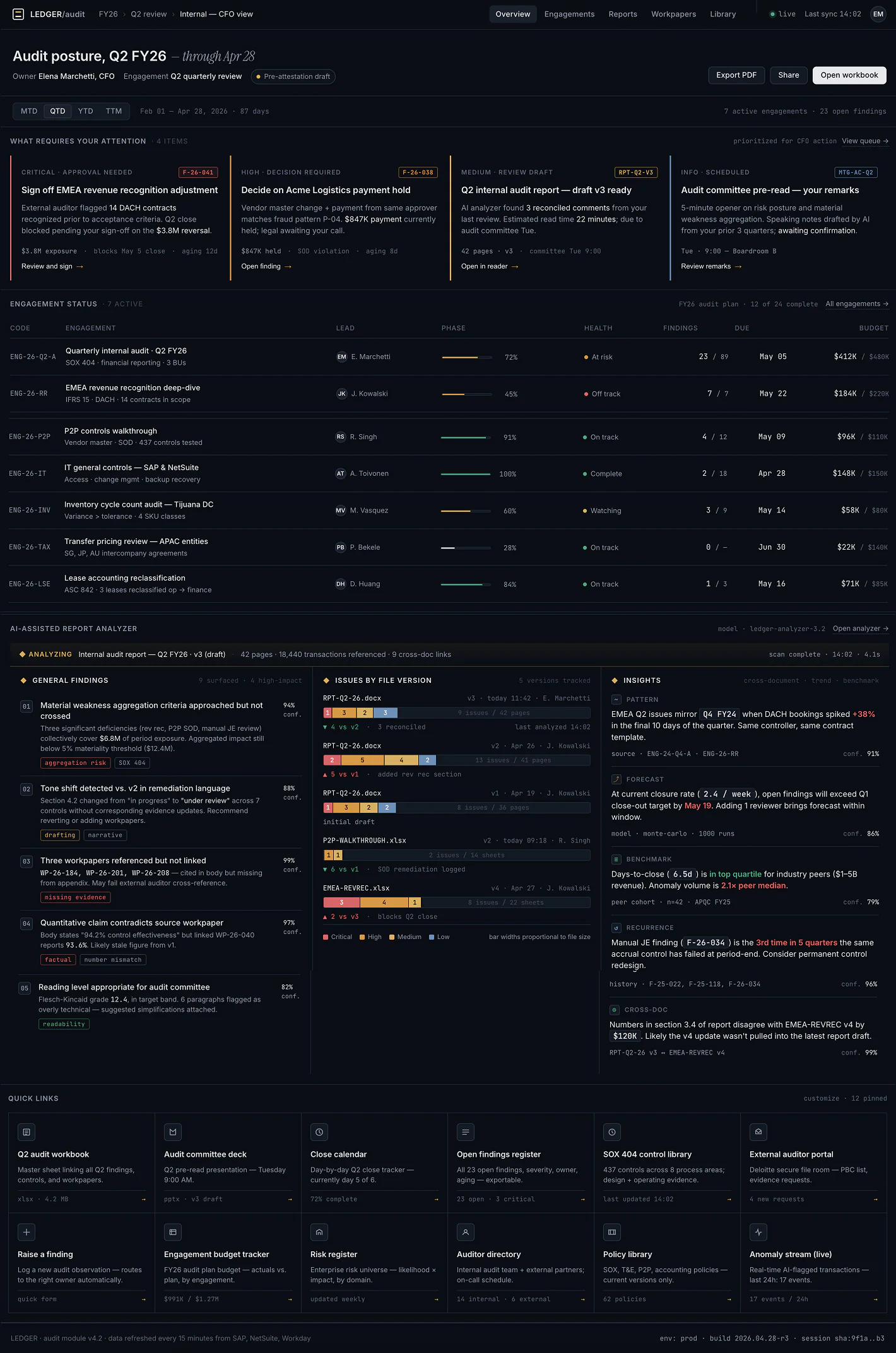
AI
Lovable