← Back to work
CASE STUDY · 03 · HEALTHCARE

Medical app redesign. Two users, one interface.

Opioid monitoring for patients. Prescription management for doctors.

Role UI Designer
Timeline 2020
Team Small product team
Product CPM · cpmed.io

An app that worked, but not well.

CPM was already in production. Patients logging opioid doses, doctors creating prescriptions and monitoring treatment. The app was functional, but the structure was unclear and the interface was dated.

More importantly, the design treated both user types similarly when their actual tasks were completely different. A patient recording a daily dose has a different mental model than a doctor managing ten patients' treatment schedules. The UI didn't reflect that.

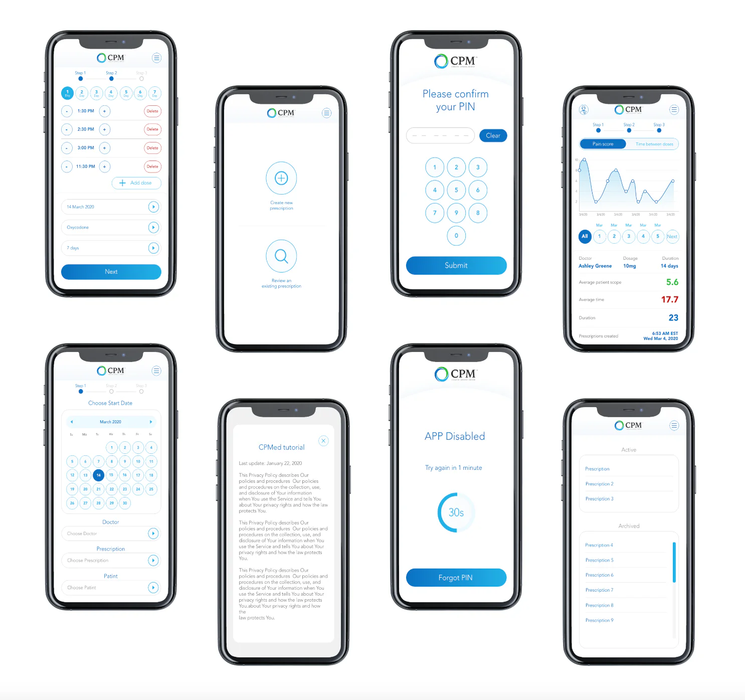
Two user types. Two mental models.

Before redesigning anything, I mapped how each group used the system.

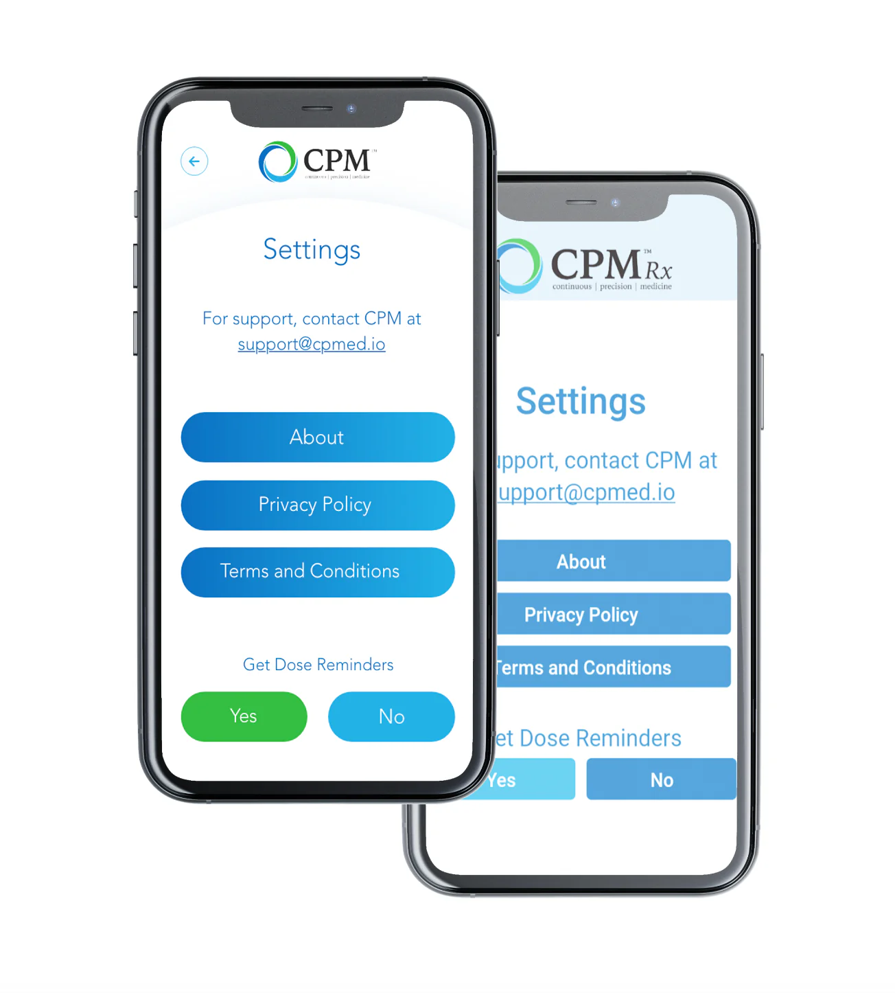
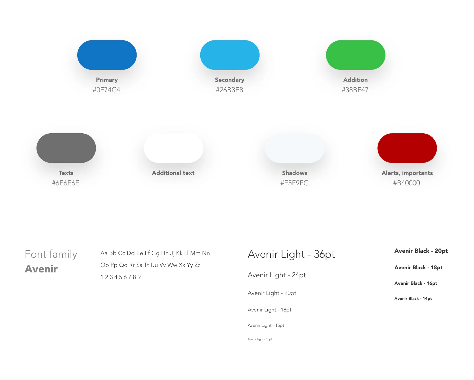
The redesign had to serve both without making either feel secondary. That meant two distinct interfaces with a shared visual language.

  1. The patient's job is simple and repetitive. Confirm identity, log a dose, check pain score.
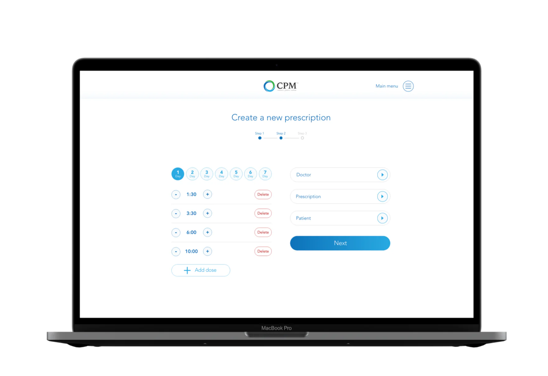
  2. The doctor's job is clinical and complex. Create prescription schedules, monitor dosage history, assess progress.
  3. One shared language. Two interfaces tuned to each task, held together by the same components and visual system.
A spread of CPM app screens on phone mockups: dose schedule with times, create or review prescription, PIN confirmation, pain score chart with dosage stats, calendar start date, tutorial, app-disabled lockout, and active or archived prescription list.
Screen inventory across the patient and doctor flows: authentication, dose logging, pain tracking, prescription creation, and monitoring.

New UI concept. Mobile and desktop.

I designed a complete UI overhaul for both platforms.

Mobile, for patients: a simplified dose recording flow, pain score tracking with a chart view, PIN authentication, and a prescription overview. Desktop web, for doctors: a multi-step prescription creation wizard and a patient monitoring dashboard with dosage and progress data.

I created a style guide and grid system documentation to standardize spacing and components across both. The visual direction was clean and clinical, familiar to medical software users but more considered than what existed before.

CPM mobile Settings screen: support contact, About, Privacy Policy, Terms and Conditions buttons, and a Get Dose Reminders Yes/No toggle, shown in default and a restyled variant. CPM style guide: color tokens (primary, secondary, addition, texts, shadows, alerts) with hex values, and the Avenir type family shown at Light and Black weights across a range of sizes.

Mobile, for patients (left), and the shared style guide: color tokens and the Avenir type scale (right).

CPM desktop, doctor view: a Create a new prescription wizard on a MacBook, showing a 3-step progress indicator, a 7-day dose schedule with editable times, and Doctor, Prescription, and Patient selectors.
Desktop, for doctors. Multi-step prescription creation wizard with the dose schedule builder.

Redesign concept delivered and specced.

Both the mobile and desktop versions were fully designed and documented, ready for development. The style guide gave the team a foundation for maintaining consistency as the product evolved.

What I'd do differently.

I focused too much on the happy path in the patient flow. Edge cases like missed doses, mid-schedule changes, and error states got less design attention than they deserved, and ended up being harder to resolve during handoff.

NEXT CASE · 01 · ENTERPRISE

Audit & Advisory tools for a Big 4 firm.

Read case study