← Back to work
CASE STUDY · 04 · FINTECH

A neobank for Kenya. Two sides, one platform.

Mobile money for consumers. Web tools for merchants.

Role UX/UI Designer (solo)
Timeline 2021
Team Solo design, ~7 devs
Engagement Freelance

Two users. One system.

Kenya has mobile money but fragmented commerce. Consumers needed one place to pay, transfer money, and order locally.

Merchants needed a way to receive payments, manage orders, and reach customers without building their own infrastructure. Cashia was designed for both sides of that relationship.

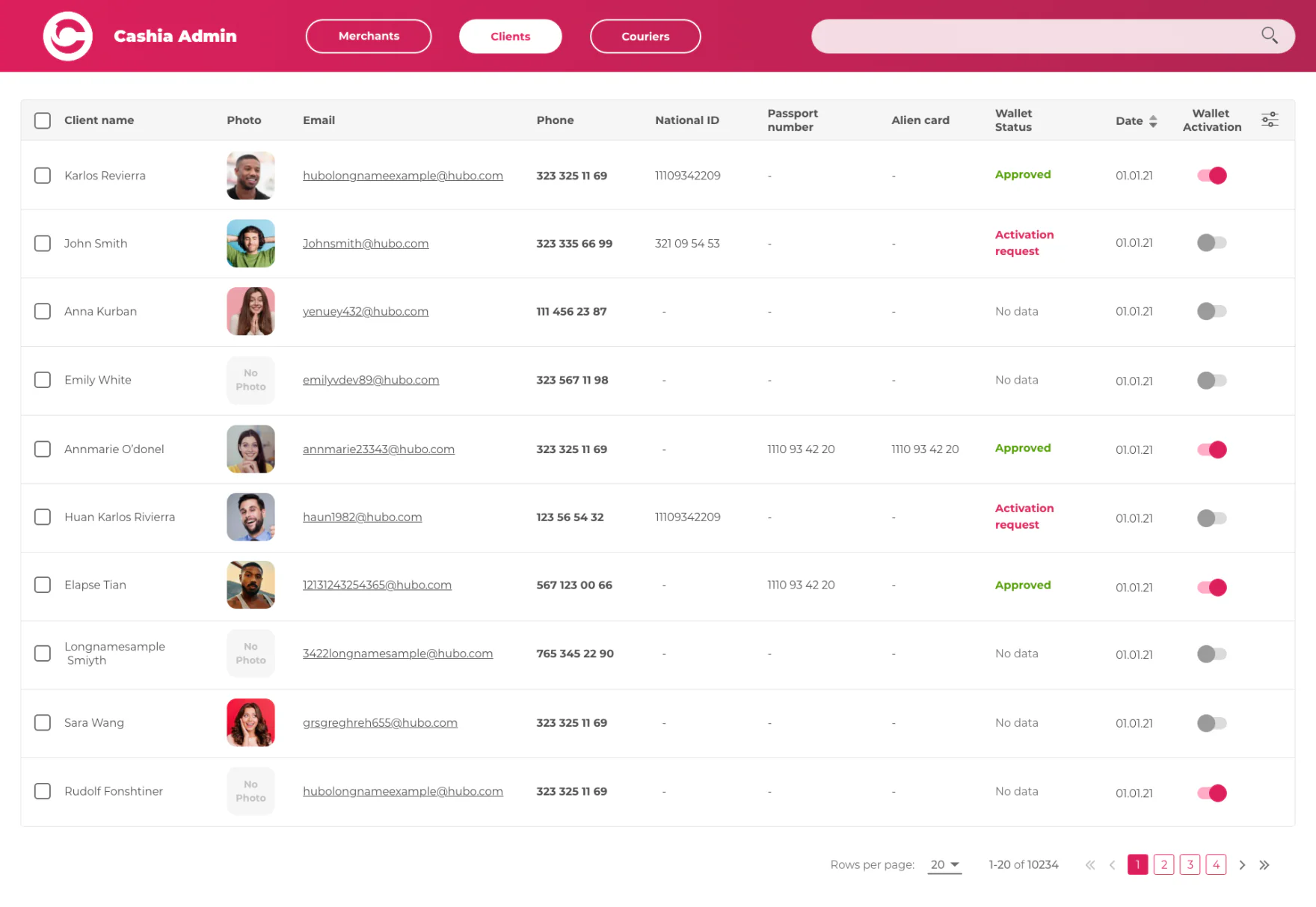
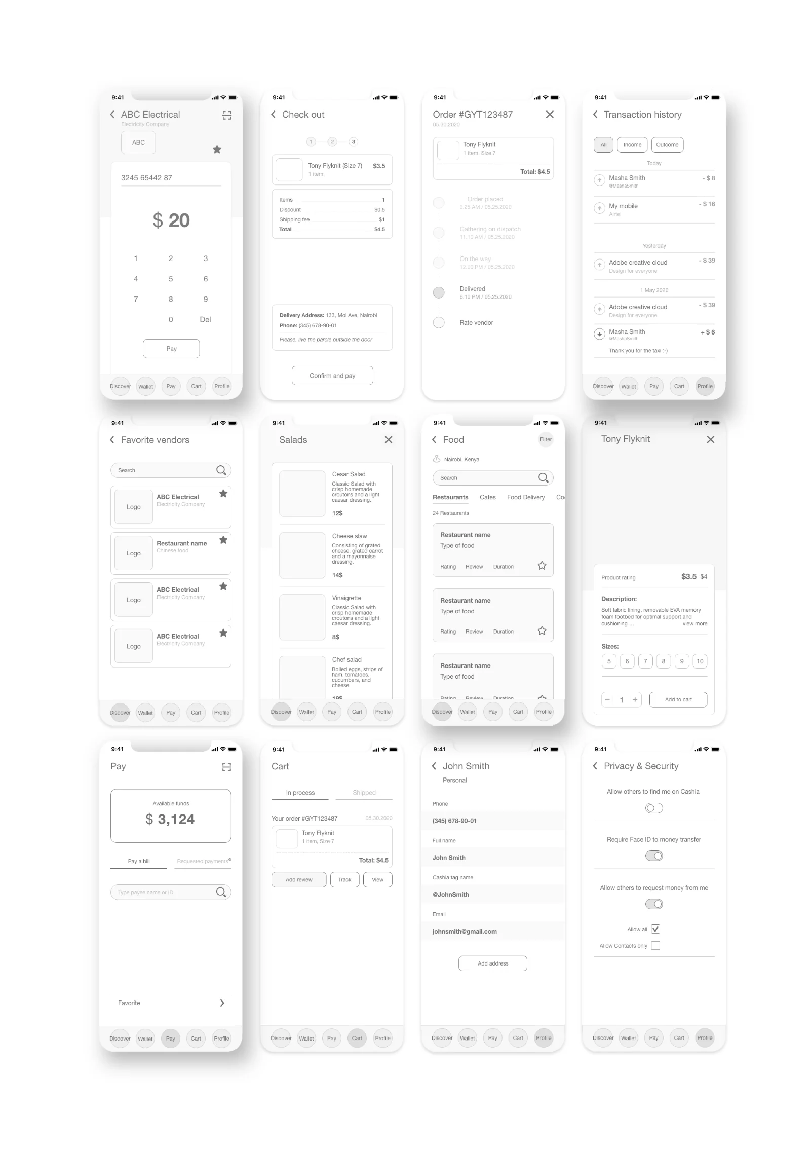
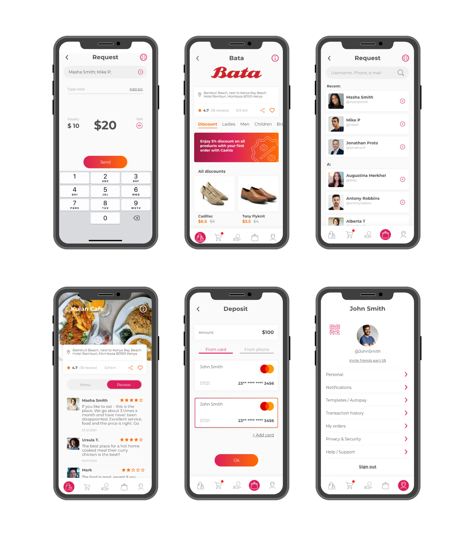
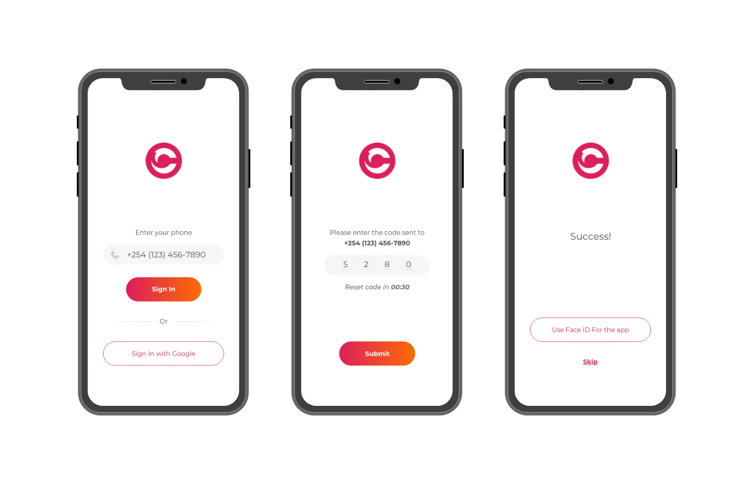
Two jobs. Two interfaces. One connection.

I started by separating the two user journeys. A consumer's job is to move money quickly and discover what's nearby. A merchant's job is to receive payments, track orders, and manage their presence on the platform.

These are different workflows that had to connect - but share no UI. I mapped the information architecture and flows for both before designing a single screen.

Cashia Admin web interface, Clients tab: a dense client table with name, photo, email, phone, national ID, passport, alien card, wallet status (Approved, Activation request, No data), date, and wallet activation toggles, plus Merchants and Couriers tabs and pagination across 10,234 rows.
The merchant and admin web side. A dense management table with wallet status, verification IDs, and per-row activation controls.

Wireframes first. UI second.

I ran the full cycle: IA, flow maps, wireframes, prototyping, mockups, style guide, and user testing.

For the consumer mobile app: onboarding with phone, OTP, and Face ID, a wallet for send, request, deposit, and withdraw, bill payments with favorites, and local merchant discovery.

For the merchant web interface: product and service listings, an order management dashboard, payment confirmation flows, and merchant profile setup.

Cashia consumer wireframes: pay keypad, checkout, order tracking, transaction history, favorite vendors, menu and restaurant discovery, product detail, bill pay, cart, profile, and privacy settings, all in low fidelity.
Consumer wireframes. The full mobile flow set mapped in low fidelity before any visual design.
Cashia consumer app screens on phone mockups: the Wallet with balance and Send, Request, Deposit, Withdraw actions, the account profile, a shop checkout, and a request-money contact list.
Consumer mobile app. Wallet, profile, checkout, and request flows.
Cashia consumer onboarding, three phone screens: enter phone number with Sign In and Sign In with Google, a four-digit OTP code entry with a reset timer, and a Success screen offering Use Face ID for the app or Skip.
Consumer onboarding. Phone number, OTP, and an optional Face ID step, kept to three screens.

Both sides delivered.

The consumer app covered payments, wallet, and discovery. The merchant web interface gave sellers tools to manage orders and payments. The style guide established a shared visual language across both products.

What I'd do differently.

User testing happened too late, after high-fidelity prototypes were already done. The merchant interface especially needed more wireframe-stage testing. The order management logic was more complex than I'd assumed, and I found that out too late.

NEXT CASE · 01 · ENTERPRISE

Audit & Advisory tools for a Big 4 firm.

Read case study